10 Nov CSS in 60 #3 – A Long Haul
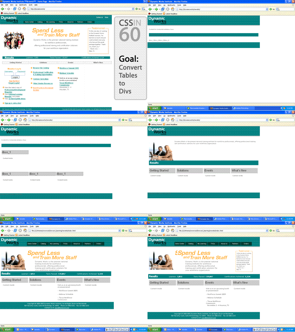
 CSS-in-60, where you can watch the progress and evolution of a CSS design project. This project has me converting an existing table-based E-Learning system/website into a CSS-driven masterpeice that is future-ready, portable and seperates style from content. The animated GIF that follows, monitors the progress of converting just the homepage. The animation is not real-time, but rather compresses many days and hours into a short, sweet, 60 second clip.
Primary client goal:
To convert their existing E-Learning system to CSS based design that will be easier for them to replicate and customize. This is realized through css design, allieviating the need to edit multiple templates and pages when any design changes are introduced.
Design Tips:
As always, clean markup is imperitive. A strong, logical document heirarchy is the first step to converting a table-based layout. I found this E-Learning system ridden with css styles. Instead of hap-hazardly stripping exterraneous tags, copying existing styles and writing unique styles for every little element, a good document model will help you break down content into logical blocks. The needed styles will become apparent from there.
Tables are for tabular data! But sometimes its not practical to replicate a table in css. This project had alot of tables used not just for layout, but for organization of content. Sometimes tables that feature alot of data, may also include elements that aren’t allowed in a table (images for example). Do your best to move the images outside the table if possible and if not, use good judgement and identify whether or not it makes sense to kill yourself trying to reproduce a table in css.. A good rule of thumb – 3×3. If you are looking at data/content that spans 3 columns and 3 rows, it may make sense to leave it a table and simply clean up any invalid markup inside the existing table.
The Clip


No Comments