16 Jan Sony PSP Web Design Primer
The Sony PSP is a portable gaming device. This cannot be denied. While homebrewed programs open more and more functionality to the PSP, it can never aspire to replace a desktop or laptop computer. It does, however, lower the barrier of entry into mobile content design. As a designer looking for additional skill sets to acquire, the mobile world has always been of interest to me. The strict restraints of a small screen, small file size requirements and the competing mobile standards are all new to a designer used to designing websites and applications for use large monitors. This design primer covers some of the basics of you need to know before designing a PSP compatible website. Note: The following information applies to the web browser bundled in the 2.0 firmware update.
Getting to know your canvas
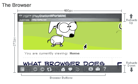
The Sony PSP has a maximal resolution of 480×272 @ 24-bit color. At 480 pixels across, its a little more than half of the standard 800×600 designers have been working with for years. You may be looking at those specs and scratching your head… yes, it is wider than it is tall – a 16:9 aspect ratio to be precise. This aspect ratio is often referred to as the “dvd” or “movie” aspect as most movies are filmed in this format. This is quite big for a mobile device. In fact, the PSP really isn’t even in the same class as a mobile phone – its that much bigger. This makes the PSP fun to work with, but not practical if you intend to learn how to design extremely tight interfaces and websites for cell phones.
Take a look at the browser you are currently reading this in. It has your standard forward/back buttons, the scrollbar on the right, the title bar where you can maximize and close the window… whew, this thing has a lot of extra stuff around it! So while someone may be using a resolution of 800×600, the available real estate for a website is actually less. The PSP differs from these typical web browsers as its buttons and title bar are retractable and translucent. This means for the first time we can actually use one hundred percent of the screen real estate without worry of browser buttons and scrollbars eating up space.

Controlling user navigation
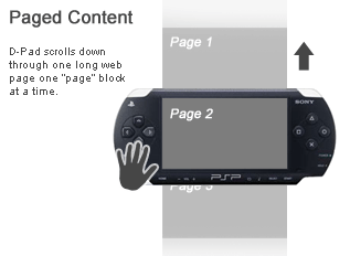
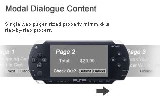
To move around the browser users have two options. The analogue stick, which moves a familiar mouse cursor around the page and allows you to scroll, smoothly and using small increments, in all directions. The directional pad acts like the Page Up or Down keys on a keyboard – scrolling one “page” block at a time. This allows for some interesting control. By setting up equally sized blocks or “pages” we allow the user to scroll through the pages, one page at a time. The same applies for modal dialogues that prevent you from doing anything else until you’ve completed the current task like e-commerce checkouts and forms. By setting up single pages that match the screen size exactly, we can create the appearance of a step-by-step process.


Font sizing and legibility
Most small screen mobile devices have readability problems – big ones. The PSP has a larger-than-normal screen, which makes it viable platform for e-books, online and downloadable content. The browser (which we know to be NetFrontâ„¢ created by Access) uses 2 fonts – serif and sans-serif. Wow. What a cornucopia…
If that wasn’t limiting enough, the font sizes aren’t much better. The smallest available size still looks a little big – I think it could go even smaller before becoming hard to read. Others may debate this however. The sans-serif is the default font used, unless serif is specified. The serif font is smaller than the sans-serif – though I warn against using it at the smallest size for the sake of legibility.
These values are approximate, play with your settings accordingly:
- Small 0.85em & under = 12px
- Medium (default) 0.9em – 1.1em = 13px – 16px
- Large 1.15em – 1.3em = 17px – 19px
- X-Large 1.35em – 1.85em = 20px – 27px
- XX-Large 1.9em = 28px
The NetFrontâ„¢ browser has the option to control font sizes through three settings: small, medium and large. The medium setting is default, like most current web browsers. Don’t even think that you can set your fonts to the smallest size possible and then think that the browser will scale the font size even smaller by using “small”. Scaling outside of the range of font sizes is not possible – regardless of if the browser is attempting to override the website’s font size. Building accessible websites typically involves allowing your users some control of what they see. Allowing them to increase or decrease your font size until they are comfortable. Thus, it will be prudent to scale your font sizes up a little so you sit comfortably within the range of sizes. Simply test your website at the three scalings (small, medium, large) and see how your fonts react. Often, using the “small” browser scaling will result in your two smallest fonts rendering the same size.
What for are the serif and sans-serif fonts named? What font is that? I don’t know. I think it appears to be close to Microgramma, but not quite. I would love to find out. It is certainly a very readable font, even at its smallest size.
Resources & Links
Pocket-Sized Design: Taking Your Website to the Small Screen A list apart
Access’ NetFrontÂâ„¢ Browser Documentation
IGN review of the PSP Browser – Plenty of screenshots of it in action and its features.
Designing for Televisions at msntv.com


1 Comment