22 Jul New Vector Flash logo courtesy of Ericart.com
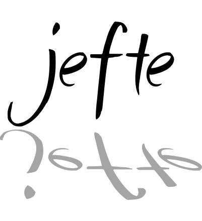
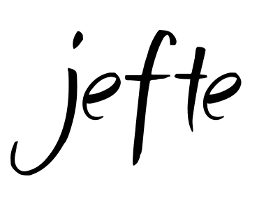
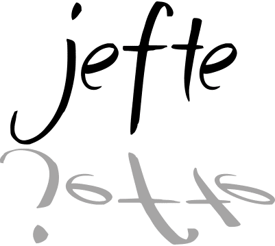
For a while now the Jefte.net has featured plain text in the banner in liu of a proper logo. E over at Ericart.com felt I needed a little more than a comic font on a flat field of color, and was gracious enough to come up with a fantastic new logotype for Jefte.net. It screams with flavor and style and could not be a better fit for the Jefte.net brand. It gives me a playful, coffee-house feeling while yet maintaining a certain sophistication. Read more to see a side by side comparison.
Some have said they do not remember the old logo (it had so much impact apparently) so here is a side by side comparison of the old vs the new.


What are your thoughts? Feedback is always welcome.


Christina
Posted at 19:10h, 25 JulyI think it looks very unique and artistic! 🙂 I like your site and especially YOSHI!!!
Jonathan
Posted at 11:43h, 26 JulyUmm all I have to say is your dog ROCKS! =p
e
Posted at 18:48h, 04 SeptemberI visit your site often just to watch Yoshi’s waggy tail. Good for hours of fun.
😉
-e