16 May Birth and evolution of an illustrated character: Penny Arcade
 Penny Arcade is probably one of the most respected, copied and successful web-comics of late. Mike Krahulik (Gabe), and Jerry Holkins (Tyco) are the co-creators behind Penny Arcade. Their unabashed opinions are hurled with ferocious might on a daily basis as they openly attack their enemies with a salvos of biting humor and coarse language typically found on HBO or fervent internet bulletin boards. As all comic characters are prone to, Penny Arcade’s characters have undergone years worth of fine-tuning and their appearances have changed, subtly. This article attempts to trace the PA timeline and study the evolution of the Tycho and Gabe characters from internet doodles – to web mavens.
In my previous article I outlined the inception and evolution of my character, Yoshi, and touched upon Garfield and Penny Arcade as clear examples of character evolution. Garfield started as a very, very, fat cat. Over the years his gut was tucked in and extra rolls removed to produce a still tubby, but more lovable character. Similarly, Penny Arcade’s auspicious start was simply the first step on a long, colorful path to success.
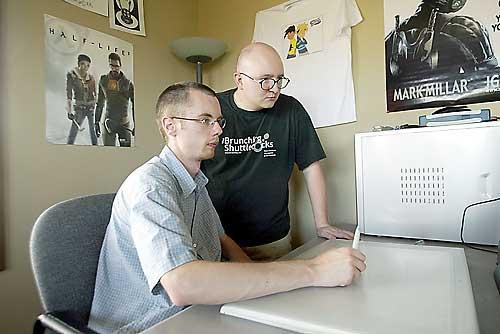
Mike Krahulik (Gabe), left, and Jerry Holkins are the co-creators behind Penny Arcade. Together they have forged an impressive archive of work and created a legion of fans. Lets meet the men and characters behind this success.
Enter the Gabe
 Mike Krahulik is the illustrator that brings Gabe and Tyco to life. Just about every day for the last 5 years, he has churned out strip after strip. This is the type of determination required to really make it. Regardless of finances, or circumstances – they put out strips on a regular basis. It is this repetition and high level of production that leads to true character development. Each day Mike drew Gabe and Tyco, he refined the characters.
House of Brahe
 Jerry Holkins is Tycho Brahe. Jerry maintains the news on the website and helps write the strips that Gabe draws. He can’t paint, draw or carve little wooden chess pieces. However, he shows his dominion over the English language and mastery over expletives to deliver blows of crushing humor. This is definitely not your Sunday paper comic strip. The language is course, common curse words are used – but delivered in uncommon ways. His writing keeps the strip fresh and current. Often targeting the video game industry they draw upon current events to keep their readership interested. Mike’s artistry is great – but without the content to drive each strip, it would soon grow stale.
The Early Years
It took two years for the Gabe and Tycho characters to evolve into what they look like today. The two you see currently on the Penny Arcade website are not the same two that started years before. Lets take a look at the earliest strips available in their archive. First up are the profile shots.
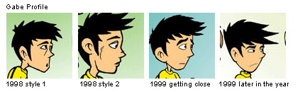
Gabe’s profile is a good example of character refinement. Early in 98 Gabe’s chin is hard and angular. As he works his way through 98 and 99 the style changes. Style 2 is vastly different from anything you can find in their archives. Clearly a path was taken that the artist didn’t like and we don’t see many other strips with this style. Its important you allow yourself as an artist to fork in this way. Let yourself travel down tangent paths and play them out to their full extent. Only through experimentation can you find your style. Through this experimentation you can see a progression as Mike removes line after line and replaces the hard angles seen in 98 with a softer look found at the end of 99.
Another area of note is the eyebrows. Early strips have very simple brows, lacking in expression. I too fall victim to using very simple eyebrows that consist of basically 3 points. Eyebrows can be one of the most effective ways of communicating expression without words. Gabe’s character develops curvy, expressive eyebrows late in 99.
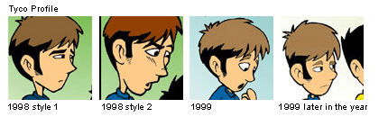
Tycho too evolves during this period. Again I point out the variant style of 98, style 2. Its just such a vastly different variation – it almost doesn’t even look like Mike drew it. It experiments with facial strokes and a slightly different shade of hair color than we see in other strips. Style 2 also enlarged the head proportion to an even larger state. Tycho’s sideburns were the target of many changes, too. Different sizes and shapes can be seen through 98 and 99. Just like Gabe, Tycho is a lot closer to the present-day version towards the end of 99. Its amazing how much 1 year of constantly working on your characters will evolve them.
PA into the new millennia
The first couple of years featured massive heads. These were tuned down and by 2002 the characters start to look a lot like what we are used to seeing. 2002 also marks the start of thicker stokes.
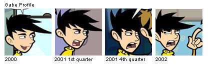
Another area of note, are the ears. During this time the ears are given several revisions. This process is one of gradual refinement. Hit and miss. Sometimes you like it, sometimes you don’t. Let yourself perform this exercise. If you do, your characters will grow.
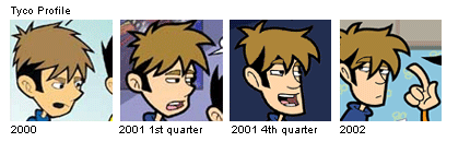
Another underlying theme of this process is simplicity. As the years passed, Mike drew simpler and simpler characters. Their expressions grew ever bolder though. Thick strokes give the characters depth and power, without adding too much more detail. The little strokes that can be seen early in 99 and 98 are now all gone. The extra angles and flat lines in the faces? Replaced with simpler shapes. Tycho’s face is consists of a straight line, and a curved one. Gabe’s is a V-shape. Most successful cartoons/comics are simple. Keep this in mind.
Final Thoughts
Don’t try to draw a masterpiece the first time out. Even talent like PA took time to cultivate and grow. Mike is a great artist, but I’m sure he learned a lot along the way. If you ask him today, he’ll no doubt agree that his first strips aren’t very good. But its those first strips that got him to where he can illustrate so masterfully today. Take a look at their site – its chock full of ads he drew. Hang in there and your character will grow.
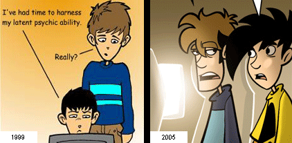
It took 5 years of work to produce that before and after shot. That’s 5 years of near-daily drawings. Five years of drawing these little cartoony characters and waiting. Some may call that silly. I say that’s perseverance, a trait few people have.
mike d.
Posted at 15:21h, 18 MayI’m glad you wrote about this. I specifically went through penny arcade a few months ago looking at the changes you discuss. I appreciate hearing a review written by someone with an eye more attuned to detail.
Nick Catalano
Posted at 08:17h, 02 JuneAnd now this article and the pictures in it is a wonderful Photoshop thread at Fark.com, to be posted at 10AM EST Mon June 06, 2005.
GIGANTOID
Posted at 10:36h, 06 JuneWOW that wacom is huge! Does he really need one that big or is he just a tiny fella?
kyle newton
Posted at 10:46h, 06 JuneAt the end of the article in the ‘final thoughts’ paragraph, the third sentence is written: Jerry is a great artist, but I’m sure he learned alot along the way.
Just a correction here, Mike Krahulik is the artist.
Good article, otherwise.
ZB
Posted at 11:05h, 06 JuneWell hooray– five years to go from somewhat likable-looking characters, to abrasive, annoying-looking farkwads that make me want to smack them in the face with a shovel whenever they talk.
Jefte
Posted at 11:10h, 06 JuneIf you had those Penny-Arcade bucks I’m sure you would have a wacom that big too! Kinda puts my puny one to utter, disappointing shame.
heather
Posted at 15:46h, 06 JuneGreat analysis. I’m not even all that much into video games but I love keeping up with Penny Arcade–it’s fresh, interesting and entertaining. I love your points about persistence and dedication.
Jefte
Posted at 22:57h, 06 JuneThank you.
Kevin
Posted at 04:39h, 21 Decembervery good
Will
Posted at 23:37h, 05 MayJust out of interest, the 1998 Style 2 you note comes from “The Patch Parade,” from 12-21-98. The interesting thing is that, according to “Attack of the Bacon Robots,” that comic was written for a contest before the strip was really created, explaining why it looks so different from the regular comics of that era.
Voltaire
Posted at 00:42h, 15 SeptemberThis was an excellent article, and I can tell you know your shit by the number of mispellings in the piece. That’s the mark of a true artist.
@ZB: The new, simple style conveys their emotions and personalities better; If you’ve ever seen them live, you know that they are snarkastic bastards and hella funny. The old style had them pinned as “Foxtrot” or “Family Circus”-type interchangable characters with humor as dry as Ann Coulter’s mangina.
Kzanderall
Posted at 20:36h, 21 OctoberI agree throughly. Mike Krahulik is one of the most dedicated webcomic artists around. He has put a lot of effort in his craft and it shows.